It’s The Little Things…

I have a confession–which will not be all that surprising to those of you who love paper crafting as much as I do. There’s something uniquely satisfying and fulfilling in getting all the “small” details in project just right. Beyond the self-satisfaction you get from producing and giving a handmade project to a family member or friend, let’s be honest: many times the recipient will not realize or truly appreciate the amount of work and thought you put into said project. That’s not to say they don’t appreciate or enjoy it–it’s simply that they don’t understand the time consuming and minute details (and heaps of creativity and love) that went into their gift.

That’s where the real satisfaction and pay-off comes in: the knowing and joy we get from all the the little things that go into a project. It is this intrinsic value in our work and ideas that no one can ever really understand or share in that feeds our creativity and fires our giving souls. I may produce a card that took hours of planning and detail work–and no one may ever quite “get it”. But, I do. I always take pictures of all my projects, so that when they are gone to their new homes, I still have a way to celebrate and remember that particular work. Every now and again, I love to flip through my pictures and look at what I’ve done and how far I’ve come. New ideas, new techniques, new accomplishments…they simply fuel my desire to do something even better and more unique. I really urge you to keep a record of your works–whether they be digital files, printed photos or written journal entries. Every so often, remind yourself of your work–good and not-so-successful–to feed your fire of creativity and stoke new ambition and drive.

The reason I touched on all of this today, is that I was extremely happy with one of my latest projects. It’s full of small details that perhaps only I will ever truly appreciate. The card literally represents hours of work–a project I returned to over the course of several days. It was a truly fulfilling creative moment for me. I only hope that whomever ends up with it, will enjoy it half as much as I did putting it together.

This project started with a piece of 4″ x 5″ kraft cardstock from Papertrey Ink. I used a VersaMark watermark stamp pad and a rubber stamp from Samantha Walker’s “Butterfly Garden” (Unity Stamp Co.) set to stamp the corner floral and butterfly image. I used some American Crafts Zing! embossing powder in Bronze and my heat tool to raise the image. After my image was completely set, I wasn’t sure where to go next with this project. One thing that “bothered” me a bit, was the stark contrast with the embossed image and the kraft background. After setting it aside for a while, I returned to it and made a few changes. I used my Stampin’ Up! ticket corner punch to take the corners off. I then used some Tsukineko Memento ink in Rich Cocoa and a sponge dauber to darken the edges of the kraft cardstock. Finally, I used some Ranger Perfect Pearls Mist in Perfect Pearl to soften the effect. I sprayed the entire cardstock with a heavy coat and waited a few seconds. Then I used a paper towel and came back over the embossed image to remove the excess spray. The mist worked perfectly to soften the image–not detracting from the embossing, but filling in the starkness of the kraft background.

This was a very feminine feeling card from the get go–and I decided to go for maximum effect in that sense. I mounted the craft cardstock embossed piece on a card base made of Papertrey Ink’s Pinefeather cardstock. I used a piece of chipboard and covered it with more Pinefeather cardstock to create the base of the cameo piece. The actual plastic cameo is one the remarkable pieces done by Webster’s Pages. (If you have not checked out their fabulous embellishments, please do so. One of my personal favorites are these cameo pieces featuring ballerinas, birds, horses, butterflies, and highly sculpted female profiles.) Once I had created the base for the cameo to sit on, I knew I wanted to do pearls. Figuring out the sizes and exactly how to lay them out was a trick in itself. I ended up using Moss Green flatback pearls from Queen & Co. in three different sizes to create the frame and hand apply them one at a time.

Feeling the need to counterbalance the weight of the heavy pearl frame, I decided to use various sizes of blackened crystals from Basic Grey to highlight the centers of each of the floral elements in my embossed corner piece. The sentiment was created using Stampin’ Up!’s modern label punch and “Fabulous Phrases” stamp set. The inside watercolored journaling block is from KaiserCraft.

There’s just something about this one that makes me very happy and very creatively fulfilled.

***************

RANDOMONIUM:

–Don’t forget there are only nine more days to enter Giveaway #16. (See sidebar link for all the details.)
–Is anyone loving AMC’s “The Killing” as much as I am? I am in love with this show’s creative beauty and brilliant acting.
–I cannot stop listening to Adele’s brilliant “21”. It’s my pick for Album of The Year thus far.

Architecturally Speaking

I’ve long been fascinated with geometric shapes. I suppose that fact–along with my love of numbers–is what led to my pursuing degrees in mathematics and economics. Beyond the intrinsic beauty of patterns and shapes that exist because of numbers, the use of those shapes and patterns in architecture, art and nature completely bowl me over. I love observing and studying the intricacy of architectural elements like columns, scrollwork, arches, porte-cochères, et al. I also have a great fondness for mosaics and tessellations.

The reason I share all of this is that the card project I’m sharing today was inspired by architecture and one geometric design in particular–the quatrefoil. The term quatrefoil literally means “four leaves”. In architecture and Christian symbolism, a quatrefoil is a symmetrical shape created by four overlapping circles of the same diameter. In more common terms, a quatrefoil is often referred to as a flower with four petals or a “four-leaf clover”. The shape was most prominent architecturally during the Gothic Revival and Renaissance. But, you can find examples in churches and cathedrals around the world today.

A while back, Stampin’ Up! introduced a stamp set, button set, and a corresponding set of three mini-punches called “Itty Bitty Shapes” (The punch set is item #118309 and sells for $16.95) . It so happened that one of the shapes (and a coordinating punch) were of the quatrefoil shape. Needless to say, I became obsessed with this punch and have explored numerous ways of creating with it. This may be the craziest in terms of sheer scope and the time involved–but I had to try it. My goal was to create a mosaic background pattern based on the quatrefoil shape. There are over 200 individual punched shapes used to create this card mat–and each one was applied and adhered by hand–one at a time. The papers used to punch out the quatrefoils were bits of scraps from Graphic 45. I didn’t want the pattern to be obvious, yet I hoped when finished it would convey a feeling of a field of flowers viewed from afar. I’m not sure I was completely successful–yet, I do love the results. I only wish you could see and feel this in person, as the photographs are truly a poor substitute.

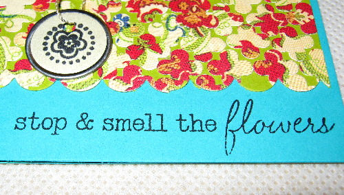
The card mat was created by using a Zig Two-Way glue pen to mount the punched out shapes on a piece of 4″ x 5″ cardstock from Papertrey Ink in Simply Chartreuse. The mat is the obvious showpiece, so I tried to keep the embellishment to a minimum. An appropriate sentiment, sequin flower, piece of ribbon and hangtag complete the mood. I hope you like it…


Technique Tips 101

This card project highlights one of my favorite techniques for using glitter–but with a color twist. While I believe this technique will work with most craft brand glitters, I should tell you that my favorite to use–and the one that I believe gives the best results–is Stampin’ Up!’s Dazzling Diamonds Stampin’ Glitter (#102023, $ 4.50). The main obstacle with this method is that you want to make sure that your glitter is adhered to your project very firmly because of the friction and rubbing involved in the technique. If your glitter is not well-adhered, obviously you’ll have glitter falling off left and right (and a giant mess to boot). You will have some glitter loss, but your adhesive is key. For me, the best results are obtained using Stampin’ Up!’s Heat & Stick Powder (#100625, $ 4.50). The heat setting provides for a melt that grips your glitter to maximum effect.

For this project, I used a 5 1/2″ x 8″ piece of Stampin’ Up! cardstock in Cajun Craze (which was scored at 4 1/4″). The card mat is a 4″ x 5″ of Stampin’ Up Whisper White cardstock. The ink I chose to use is Stampin’ Up! Poppy Parade applied with a sponge dauber.

Using a 3″ x 3″ square of Whisper White cardstock, I stamped the floral image (Stampin’ Up! “Fabulous Flowers”, #109343; now retired) with a VersaMark pad and then coated it with a layer of Heat & Stick powder. Using my heat gun, I melted the layer of Heat & Stick powder until it reaches a clear, shiny finish. Then I poured a layer of Dazzling Diamonds glitter over the heated adhesive. At this point, you want to re-heat the image to ensure that the Heat & Stick powder and the glitter make a full bond and then allow your image to cool.


Once your stamped and glittered image is cooled, choose an ink color that coordinates with the papers your are using in your project. In my case, I chose Poppy Parade. Using a sponge dauber, I applied two to three coats of ink over the entire surface of the image–both on the glitter and the paper. You want to make sure you have fully saturated the color to an even layered application. I then used my Tim Holtz serrated scissors to cut around the image following the petal patterns as a guideline. Once you’ve cut your image, lay a craft mat or scrap paper out and place your image on it. Taking several pieces of Kleenex tissue and balling them up, vigorously rub in a circular motion across your glittered image. The friction with the tissue causes the excess ink to be absorbed and leaves behind a glittered surface with a slight hint of color. Don’t be alarmed that the tissue starts to tear and “ball up”. The jagged texture of the glitter will do this. It is a bit of a messy procedure, but the final results are definitely worth the effort. (I should add that it is very hard to do this technique justice with photographs. I promise you in person that your images will sparkle and shine like a vintage jewel.)


Next, I took the 4″ x 5″ card mat and used the sponge dauber to create a spotted effect for the card background using the same Poppy Parade ink. For the final touches on this card, I used one of the new Stampin’ Up! sets, “Curly Cute” (#120510, $ 14.95), for the sentiment. I stamped it with VersaMark and heat embossed it with white embossing powder. I added a piece of 1/4″ Stampin’ Up! grosgrain ribbon in Real Red.


I hope you’ll experiment, play and modify this technique to use with some of your own projects. It really is a fun technique and creates some very eye-catching results. Happy Wednesday Crafters!

Tim Holtz Fragments

Last week, I highlighted a card (‘Where You Are…’) that featured a new technique I’ve been playing around with. For the sentiment on that card, I used a solid Tim Holtz Fragment (basically an oval piece of clear acrylic plastic) to create a stamped plaque for the card. The basic process was stamping a greeting on a piece of decorative paper with StazOn Jet Black ink and then adhering the stamped paper to the Fragment with the use of Ranger Glossy Accents medium.

Since I made that card, I’ve been working on making some jewelry pieces–pendants and the like–with Tim Holtz Fragment charms. These acrylic charms come in a variety of shapes and sizes. They’re easy to adapt into necklaces, earrings, brooches–virtually anything your mind can think up. The mediums you can use are just as wide-ranging. You can use photographs, decorative papers, personal mementos and other memorabilia to create personal miniature works of art.

For the three pendants I created, I used the following materials:

  • PAPER: Tim Holtz “Lost And Found” Idea-ology paper stack;

  • TOOLS: Tim Holtz Fragments charms, Ranger Glossy Accents medium, decorative clear packing tape, Tim Holtz jump rings, Tim Holtz bead and ball chain, scissors, paper piercer, brayer or rub-on tool;

  • The basic process involves choosing your charm shape and size. Then you want to use a piece of square decorative paper larger than the charm size you chose. You apply the Ranger Glossy Accents directly to the backside of your Tim Holtz Fragment. Use the applicator tip of the bottle to make small even circular motions all over the charm back. Then you carefully set the Fragment on top of the area you want to appear on your charm. Press firmly to disperse the Glossy Accents medium across your piece. Then you want to turn your piece over and use a generous piece of decorative packing tape (or just a plain clear tape that you’ve stamped a design on) across the back of your charm. This protects the paper backing as well as helps to contain the Glossy Accents properly. Now that your “sandwich” is created, you can go back and use a brayer or rub-on tool to press the top and bottom of your charm together. If some of the Glossy Accents runs out the sides, don’t worry about it. After the piece is completely dry, you want to use scissors to cut around the excess paper and tape–as close to the sides of the Fragment as you can. Use a paper piercer to open the hole on your fragment to add a jump ring or other attachment. I went back over the edges of the charm with a Basic Grey precision file to make sure all the edges were even and any excess paper or medium was removed. Now, you’re ready to make your finished jewelry piece. I will warn you that these become very addictive to make–and are terrific gift items. (I should also note that all the directions can be found in Tim Holtz’s ‘Compendium of Curiosities’ book as well.)


    On The Edge

    Last night, I finally got around to playing with some of my new Tim Holtz ‘On The Edge’ dies. You will recall that these new dies are part of a collaboration between Sizzix and Tim Holtz for a new line called “Tim Holtz Alterations”. This die is unique in several ways. First, it is a new size and shape for the Sizzix line. The dies are 6″ x 2 3/4″ in measurement and are designed to cut a perfect 5 1/2″ border (which of course is the standard A2 card size). Each die (with the exception of one) actually features two cutting edges–one on each side of the steel rule die. You can use them in tandem–or simply use only one cut. For this project, I experimented with the die called ‘Ornate’.

    I chose to use Stardream So…Silk! mica cardstock in Fair Blue for my base (cut at 5 1/2″ x 8 1/2″, scored at 4″). The decorative paper I chose for the front is from Cosmo Cricket’s “Material Girl” collection (cut at 5 1/2″ x 4 1/4″). I adhered the decorative paper before I began to cut with my ATG 714.

    I used my Cuttlebug and On The Edge Die on each end of my cardstock, making two decorative cuts by simply reversing the die on each pass.


    Flipping the cardstock back to the front side reveals the shape my card will take. I really love this set of coordinating cuts. They remind of the top of a pagoda.


    For the embellishment of my card front, I combined some velvet leaves from 7 Gypsies with a felt flower from Heidi Swap. I also used a sequin, silver bead and crystal floral center from Prima Marketing. I adhered the pieces of my floral embellishment together with Glue Dots and then used All Night Media 1/2″ pop dots to adhere the piece to my card front. I used a piece of Pebbles grosgrain saddle-stitched ribbon to complete the effect. The sentiment is from Stampin’ Up! and was stamped with Papertrey Ink’s Enchanted Evening ink. The final touch was a Jenni Bowlin journaling block to the card’s interior (as the color was very deep for writing to show up clearly).


    There are a total of six (6) Tim Holtz Alterations ‘On The Edge’ dies released thus far. Of course, I had to add them to my craft tool collection. From a card making perspective, I would highly recommend these dies to anyone. They are versatile with dual cuts. They’re easy to store and use. They work with your Sizzix Big Shot or ProvoCraft Cuttlebug. But most importantly, they give you the ability to really jazz up the look and edges of your cards for a very unique look. The dies released thus far are: Brackets, File Tabs, Ornate, Plaque & Postage, Scallops, and Scrollwork. Each die retails for $13.99.

    I hope you all have an incredible weekend ahead. Don’t forget that the next Giveaway (see sidebar) will close this weekend. As always, Keep Crafting!

    Caged Bird

    For my second exploration with Tim Holtz’s new Alterations line, I decided to use the Sizzix Bigz die entitled “Caged Bird”. I also wanted to make a home décor piece instead of my usual card. I have to confess that I’m actually not through with this project, but I was so excited with the results thus far that I couldn’t wait to share it with you. I will be framing this in a thick dark wood frame as it is meant to be a small wall hanging.

    The “Caged Bird” steel rule die will cut three pieces when run through your Sizzix Big Shot or ProvoCraft Cuttlebug. You will get the birdcage frame, the bird’s body on a branch, and a bird wing. Instead of working with cardstock (and since this was intended to be a home décor piece and needed to be a bit sturdier), I chose to use a piece of thick chipboard as my base and Tim Holtz Grungeboard to cut my pieces from. The chipboard is a very sturdy piece from a Die Cuts With A View (DCWV) assorted chip board stack. The 4″ x 6″ chipboard is covered on both sides with a textured cardstock in a dusty rose color. The Grungeboard was a 4″ x 6″ sheet as well, though it had a “dots” texture to it. I would have preferred a plain piece when I started, but in the end, the texture added some nice highlights to the elements.

    With my Grungeboard pieces cut out via my trusty Cuttlebug, I used some Tim Holtz Distress Inks and my applicator to color the pieces. The cage was colored with Black Soot distress ink. The bird body and wing were colored with Mustard Seed; The legs and branch were colored with Walnut Stain. I was pleased with the look of the cage. The Black Soot gave it the look of an ornamental iron piece that had seen some use and wear. The bird’s body, however, just didn’t pop enough for me with just the inking. I decided my caged bird needed to be a focal point. I used some adhesive and canary yellow glitter to coat the body and wing. After they were completely dry, I used some Smooch ink to accent his eye and his beak.

    One of the main reasons I chose to use Grungeboard was for the pliability and dimension of the material. All along, my theme was to have the bird “breaking out” of his cage to leap to his magical flight. That’s why I sort of threaded his body through some of the bars of the cage and made sure his wing was exposed from captivity. This type of manipulation would have been difficult without a material that had some give to it and did not permanently bend or crease. The wing and the cage are attached to the backdrop chipboard using Stampin’ Up! Stampin’ Dimensionals–which again emphasizes the dimensionality of the project.

    The die for “Caged Bird” punches out five holes on the bottom of the cage as a decorative detail. In my mind, I had already pictured hanging some crystal chandelier drops from the holes. But as I worked on the project and developed the theme of the bird breaking out of his cage, I though some Tim Holtz typewriter key charms might be a better bet. With the sentiment of “FLY” in mind, I chose three charm backings and used the circular alphabet stickers for my word. Originally, I wanted all of the charms to be the creme color. However, I couldn’t find a “Y” in that coloration and had to use a black sticker. At first, I was disappointed with the look. But upon further study, I really like the off-kilter lettering. Not only does it tie into the cage color, but it sort of identifies that “breaking out” theme by achieving your goal no matter what it takes (like the wrong color letter). Once you place the letters in the charm frames, you use an adhesive acrylic bubble to cover the charm. I used some Tim Holtz jump rings to attach the charms to the cage. For the two holes that did not have dangles, I covered them with rhinestones.


    The final touch on the project was the hanging chain atop the cage. Again, the chain is from Tim Holtz. I attached it to the cage with another jump ring. To anchor the chain, I chose a fabric and crystal covered brad from K & Co. to complete the look. I pierced a hole through the chipboard and inserted the brad. I think once I mount this piece in a frame, it’s really going to set off the look. I will try to remember to photograph the finished piece and share it with you later.


    A Compendium Of Curiosities

    Yesterday was all about Mr. Tim Holtz for me (and my pocketbook). First, I received my copy of Mr. Holtz’s new book, “A Compendium Of Curiosities”–which I’ll get to in a moment. Secondly, I ordered nearly $200 of his new Alterations line. I am in awe of the versatility of some of the new Sizzix Bigz dies and edge dies he’s come up with. If you haven’t visited Tim Holtz’s blog as of late, I highly recommend you take a look at the set of new videos he posted describing his intentions and examples of the new Alterations line of products. Needless to say, I’m hooked (line and sinker). I’ve always been a fan of Mr. Holtz’s tools and products (a fact my craft stash would attest to in a court of law). I suppose his aesthetic may not appeal to all crafters, but I have to say I love the grunge look of his style and his methods of repurposing objects and trinkets. It’s also one of the few craft lines that is very male and teen friendly (in my opinion). Among the dies I am eagerly awaiting: Caged Bird, Fanciful Flight, Gadget Gears, Tattered Florals, Hanging Sign, Ornamental, Keyholes, Styled Labels, Three Hole Punch, and File Tabs. (The sad part is there are still a few more I want–but they weren’t in stock at the moment. So, I’m sure I’ll be placing another order on down the road.)

    But enough about my shopping habits…and on to the book. Can I just say right up front that this book belongs in every crafter’s library. Whether you are a Tim Holtz fan like me or just interested in new methods, techniques, and ideas, this book is for you. The hardcover book (with interior spiral binding) measures approximately 8 3/4″ x 8 3/4″ and has 77 pages. But don’t be fooled by that number. The book is bursting with information and wonderfully rendered color photographs presented with Mr. Holtz’s usual panache and flair.

    Beginning with a brief introduction to the man and his studio–as well as a list of products he has developed or helped to develop and their intended uses–the book wastes no time getting to its essential core. It’s broken down into three major sections: Ideas, Techniques, and a Gallery.

    In the Ideas section, Holtz explores different elements and embellishments and how they can affect your projects–whether they be layouts, cards, mini-books, etc. Among the topics he discusses and shows examples of:

  • ornate plates
  • foilage
  • corner
  • tags, tokens, & sticks
  • type charms
  • gears, sprockets, & timepieces
  • numerals
  • keys & keyholes
  • adornments & vintage buttons
  • curio knobs & foundations
  • film strip & ruler ribbon
  • fasteners & washers
  • mini clips & pins
  • trinket & memo pins
  • hitch fasteners
  • hinge clips & D-rings
  • swivel clasps
  • ball, bead & link chains
  • tickets & stickers
  • paper stacks
  • grungeboard & grungepaper
  • fragments

    My favorite section has to be the Technique section. In it, Mr. Holtz teaches us to use some of his famous techniques, tips and tricks. What’s clever is that most of them are done is six simple steps with accompanying full-color photographs. Among the techniques highlighted are:

  • wrinkle free distress
  • scribble stain distress
  • water stamping
  • blended batik
  • dabber resist
  • perfect distress
  • inking grunge
  • double distress
  • rusted enamel
  • distress crackle
  • distress powder
  • chipped enamel
  • rusted grunge
  • distress stickles
  • rock candy distress stickles
  • altered metal with paint
  • shabby chic
  • weathered wood grunge
  • alcohol ink monoprint
  • alcohol ink splatter
  • alcohol ink agate on grunge
  • industrial grunge
  • tinted vision fragments
  • altered metal alcohol inks
  • colorful layered fragments
  • masks basics
  • inking and stamping masks
  • distress misting masks
  • extreme masking
  • fragments basics
  • dimensional collage fragments
  • fragment charms
  • grungepaper flowers
  • multi-medium collage
  • design details

    The final section is a wonderful gallery of projects done by Mr. Holtz that incorporate many of the techniques, tools, and examples used throughout the book. What really surprised me was that even someone like myself who has used a lot of Holtz products can still find new information on how to use products that you hadn’t thought of or didn’t realize you could do. I was really excited by the fragments projects (and will be working on some of those in the near future.

    “A Compendium Of Curiosities” retails for $24.99 and, in my opinion, is worth every single penny. I highly recommend this book to anyone with even a faint interest in papercrafting.

  • Celebrate Today!

    I, like many a crafter, have to admit that I am in love with bling. If it shines, sparkles, glitters, I’m worse than a blackbird. In part, I think my fascination with bling stems from my true interest in jewelry design and collecting. I love Russian history and fell in love with the work of Carl Gustavich Fabergé. Most known for the magnificent jeweled Easter eggs that he created for Czar Nicholas II, Fabergé actually created wonderful jewelry and carved stone pieces. With that as a backdrop, I became fascinated with the jewels of Bulgari, Chanel, and other famous design houses. Over the years, I’ve collected many books, jewelry pieces and artifacts. I’ve even sketched some of my own jewelry designs–and replicated a few of them.

    To translate my love of all things jeweled into some of my paper crafting designs, I love to experiment with new techniques. Some of my ideas crash and burn, but last night I had a real success with an experiment using to Stampin’ Up! products I highly recommend you try if you haven’t already done so–Dazzling Diamonds Stampin’ Glitter and Stampin’ Up! Heat & Stick Powder.

    The materials list for this card project includes:

  • PAPERS: Papertrey Ink Paper Basics Kraft Cardstock (cut to 5 1/2″ x 8 1/2″ and scored at 4 1/4″), Stardream Fuse Mica cardstock in Bronze;
  • INKS: SEI Chalk Ink in Cocoa;
  • STAMPS: Papertrey Ink ‘Dot Spot’ clear acrylic stamp set (#2204), Papertrey Ink ‘Mega Mixed Messages’ clear acrylic stamp set (#2126);
  • EMBOSSING SUPPLIES: Tsukineko VersaMark Watermark Stamp Pad, Dazzling Diamonds Stampin’ Glitter (#102023), Stampin’ Up! Heat & Stick Powder (#100625), Stampin’ Up! Embossing Buddy (#103083), heat gun;
  • TOOLS: Stampin’ Up! Scallop Oval punch (#114889), Stampin’ Up! Large Oval punch (#107305), Stampin’ Up! Stampin’ Dimensionals (#104430), Zig Two-Way Glue pen;
  • To begin, I took my plain Kraft cardstock and rubbed the card front with the Embossing Buddy. I then stamped two of the images from the ‘Dot Spot’ stamp set with VersaMark in a random pattern. I purposely left space in the lower right hand corner to add my sentiment later. Next, I completely covered the VersaMark-ed images with the Heat & Stick Powder and tapped off all the excess powder. Heat & Stick is a very fine granulated white powder that when heated turns into a glossy adhesive. I used my heat to give the card front several passes until the white powder had completely liquified on all of my stamped images. At this juncture, I sprinkled the images with a heavy coating of Dazzling Diamonds glitter. You want to get your glitter onto the melted Heat & Stick powder as soon as possible to allow for complete adherence. After tapping off the excess glitter and placing it back into the jar, you want to use your heat gun again to help set the glitter completely. (The second heating helps to reliquify the Heat & Stick powder and fuse the glitter so none of it will rub off on repeated touch.)

    At this point, you want to let your project set for a bit and completely cool. While the Dazzling Diamonds glitter is very sparkly, it does not show up well on Kraft cardstock. Here’s where I experimented with an idea I had be toying with in head for a while now. I think for this next step a chalk-based ink works best (as it allows you to rub-off the excess and it will not complete saturate the glitter. I took a 1″ cube of SEI chalk ink in Cocoa and completely covered the front of my card quite heavily–paper and embossed images. The trick is that the paper really soaks up the chalk ink, while the glitter provides an interesting resist effect. After the front was completely covered, I took several Kleenex tissues and began to rub in circular motions across the entire card face, starting at the top and working across and down in rows. You will need several tissues as the ink will definitely come up and can be a bit messy. You’ll want to make sure you have your work surface covered with scrap paper or other working mat.

    When you rub on the embossed glitter images, do not be delicate. The Heat & Stick powder has completely adhered the glitter. You may see a few loose flakes, but don’t worry. You really want to get as much of the ink off as you can with the tissue. (Note: The rough texture of the embossed glitter will tear up your tissues and create odd little inked balls of debris. Just shake them off and continue the process until your happy with your color gradient results.)

    Once I was happy with the color depth of my cardstock and the glittered images, I created the sentiment by layering an oval punched piece of Kraft cardstock on a scallop punched piece of Mica cardstock. I glued them together using a Zig Two-Way pen. I then used the Stampin’ Dimensionals to lift the scalloped sentiment medallion up off the card front.

    The end result was a card full of sparkle and shine. It is very reminiscent of exploding fireworks high overhead. Every tilt in the light source give off a different shades of brown, yellow, citrine, bronze, blue, and white light reflection. It’s very hard to show the true beauty of this card in photographs because it sparkles so much. But, I hope you’ll get the effect in these shots.


    Thanks for stopping by today! Don’t forget to check out Giveaway #4 (if you have not already done so). I hope your weekend ahead is full celebrations and explosions of color. As always, Keep Crafting!

    Artist Trading Cards (ATCs)

    I’m by no means an expert on the whole phenomenon of Artist Trading Cards or ATCs, as they are often referred to in shorthand. However, it is a form of paper crafting that does appeal immensely to me. I think the intriguing thing about ATCs is tied to the size of the final project. The only die-hard rule of ATCs is that finished size of your project must be 2.5″ x 3.5″ (64mm x 89mm). Other than that, the design and materials to be used are as endless as your imagination. While, it is obviously a temptation to go crazy with the dimensionality, the key to a good ATC design is that it be “portable art”, that is a trading card that is easy to store or take with you.

    You can explore stamping, textures, paints, inks, sketching, stitching, papers, found objects, and so many other techniques with ATCs. ATCs can be modern or vintage, bold or subtle, themed or free-form. I’ve used my own sketched images, pieced collages, Cricut die-cuts, and various objets d’ art in my own ATC collection. Of course, much of the fun in ATCs is trading with other budding artists and sharing your inspirations/works.

    I recently joined a “Your Choice” ATC Swap through the Cricut Message Boards. The three (3) themes I selected to participate in were: “Love”, “Asian”, and “Black & White”. Here is a peek at the designs I came up with.

    For the Love theme, my design is called “Without End”. It combines a Marah Johnson image stamped with Tsukineko Brilliance Rocket Red Glare and an accent paper from DCWV Rock Star paper stack. The edges are inked with StazOn Jet Black ink and the cards are accented with Sakura Gelly Roll Metallic pens.

    The Asian theme is called “Asian Lamp”. The base paper is from DCWV Far East collection. The card edges were inked with a crimson pigment. I used some kanji characters and a layered die-cuts of an oriental paper lantern as focal points. Kanji are originally Chinese characters that are used in the modern Japanese logographic writing system. Each card in the set, showcases a different lamp and kanji character combination.

    The final set was an interesting challenge. Black and white is a restraint in that it means there is a lack of color. I decided the images should be stark and visually interesting. The card design is called “Life”. The wording is done with a ransom styled alphabet stamped with StazOn Jet Black ink. The fingerprint (which is my own thumbprint) is also inked with StazOn. I used Sakura Glaze Pen in Black for the accents. The “messy” smudges were intentional–as Life is never without its messes. The thumbprint represents the “touch” of someone in your life.

    I urge you to try your hand at ATCs. All you need is a stiff cardstock or chipboard base, your imagination and whatever embellishments strike your fancy. You can spend minutes–or hours on your designs. The finished projects look wonderful in frames, in cards, stored on a rolodex turnstile or cataloged in baseball card trading sleeves. Consider them mini-art projects for the soul.

    Create–and keep crafting!